Three Baby Dolls Meet For The Fist Time
When
creativity
turns
artificial
what
stays
real
As AI becomes a creative tool, how does it shape the role of designers? This interactive installation invites visitors to step into AI-generated design worlds, sparking reflection on collaboration, control, and the future of creativity.


Three Baby Dolls Meet For The First Time let’s everyone work with AI for the first time.
The project started in 2021, long before any other user-focused generative AI applications. It brought this then-very-technical topic into the street, where everyone could use it—for the first time.
I created this installation as part of my bachelor thesis, including organizing the hardware and programming the interface and recieved the best possible grade for both.

Stories are organized into chapters which contain multiple sections.
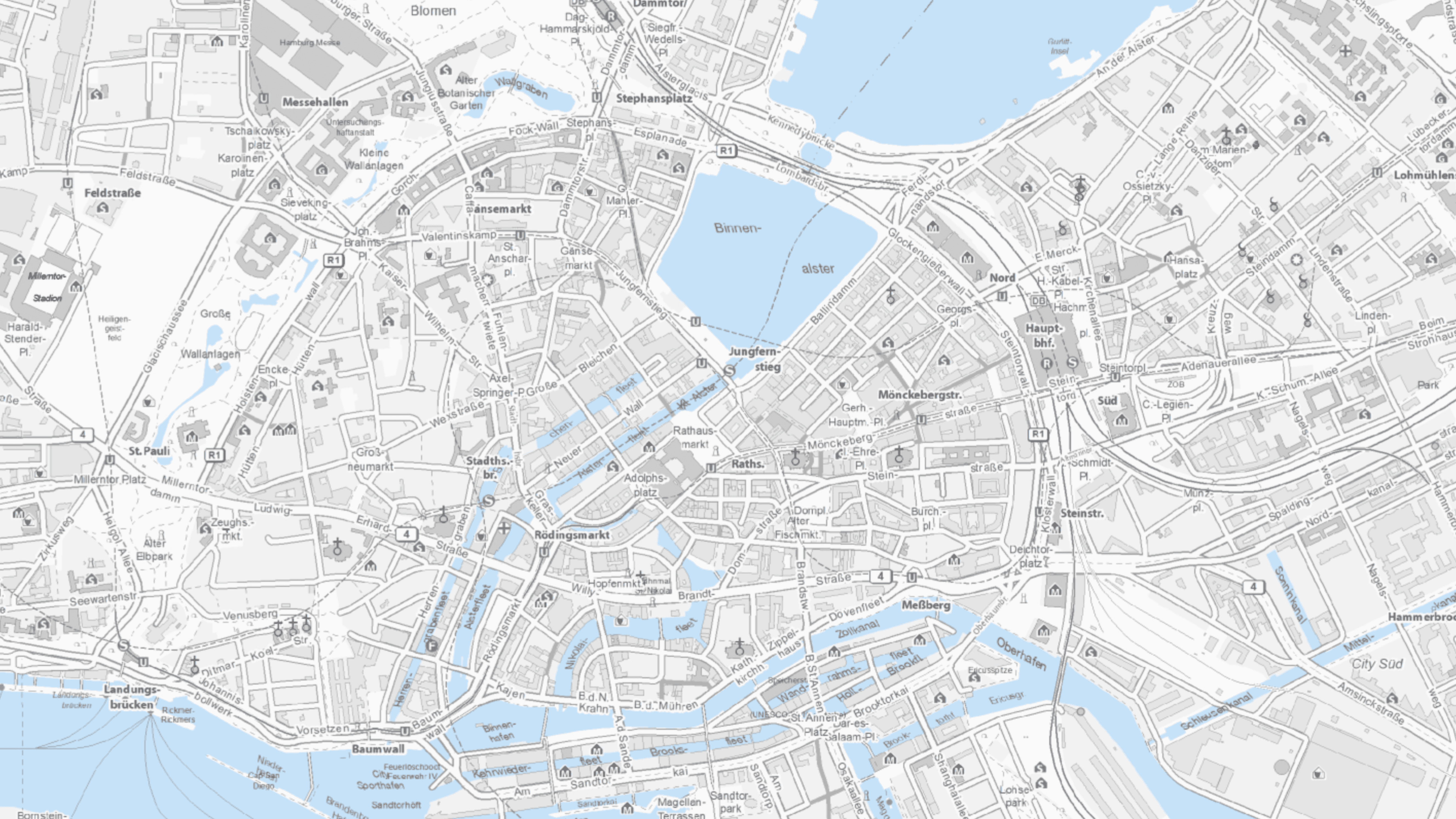
These sections contain Map data and context information about it.


Let’s begin at the heart of the tool: The story creation flow.
The feedback shows that users often felt overwhelmed, unsure, or even frustrated when trying to create a story. To understand these pain points in depth, I began by analyzing the current experience and reviewing insights from earlier user tests.

The reactions of testers can be described as feeling out of control, strictly following the requests of the system they are using. The experience did not create a sense of creating a story. Most would prepare the story in a different place and then simply input their results.
Story First
The story a user wants to tell should always be at the center of the experience. Technical information should only complement it.
Flexible Structure
The process should feel open and adaptable, allowing users to build their story as they go without needing to follow a strict order.
Stay Oriented
Users should always know where they are in the story and what part they’re currently editing.
Let’s continue with the home page -
the first impression of the tool.

A lot of testers felt thrown into cold water, not understanding what the tool is even about. Let’s make getting to know the tool a more welcoming experience.
Defining areas of improvement


The final reactions show that there is still a lot of potential to optimize the User Experience and functionality.
Despite all the efforts to clean up the process, in general it still feels too techy and is only partly inviting to users.
Some inputs are still very technically designed (like the map popsition and zoom selectors). In a second round this could get more love by designing them in a way a user would naturally use them.
Even though the text part of each step is now on the top, there are still few functionalities to create a story. It is still a single text field to paste a paragraph. A future version could incorporate pin-like text options so text can be directly placed on the map or other functionalities that unpack what is happening on the map much more. And increase focus on the story much more, moving formalities even more into the background.
Additionally the data layer selection list also does not help the user much if they dont know well what they want to add. More structure, small introductions and iconography could greatly improve usability further here.
A lot of these unimproved ux decitions stem from the lack of time both in ux and in development to implement a more user centered solution instead of the straight-forward one that is already there. Despite these shortcomings im still proud of the improvement made to the ux in this short amount of thime. Maybe in the future these things can be improved.